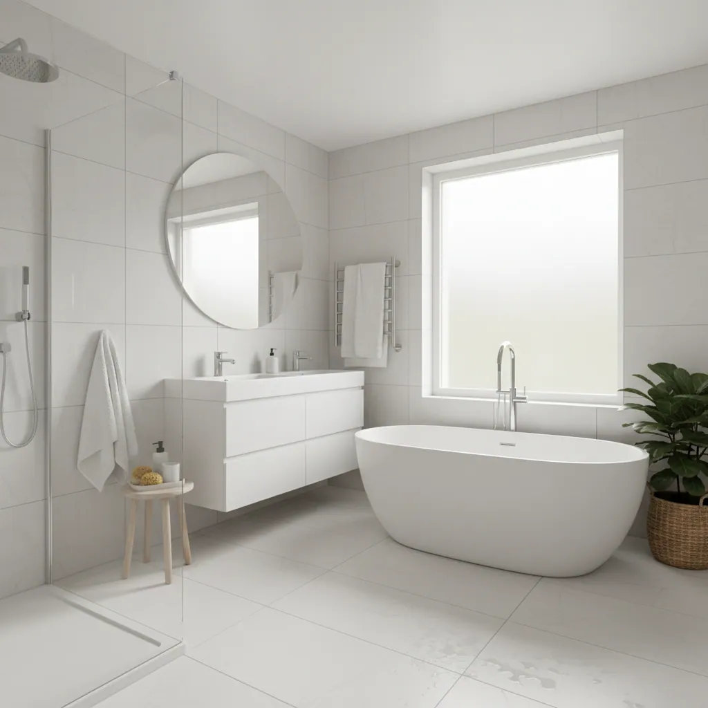
Bathroom colour & design
Colour is the thing everyone worries about most and plans least. It is also the cheapest part of a bathroom to get right and the most expensive to get wrong, because tiles and sanitaryware are fitted for a decade or more. This guide walks through how to build a bathroom colour scheme that actually holds together — the timeless neutrals, the warm-versus-cool question that matters more in Plymouth than most people realise, the trends worth following and the ones worth ignoring, and how to keep a room feeling fresh for years without redoing it. It is written from fitting hundreds of bathrooms across Plymouth, not from a mood board.
Why colour matters more in a bathroom than anywhere else
A bathroom is the one room where colour and material are welded together. In a living room you can repaint a wall or swap a sofa in an afternoon. In a bathroom, the biggest colour surfaces — the tiles, the bath, the basin, the shower tray — are grouted, sealed and plumbed in for years. Get the palette right and the room feels calm, considered and worth showing off. Get it wrong and every shower is a small reminder of the tile you wish you had not chosen. That permanence is exactly why the colour decision deserves more thought than the average customer gives it, and why we slow people down before they commit to a full wall of a colour they fell for under showroom lights.
Bathrooms are also small, enclosed and artificially lit for much of the day. Colour behaves differently in a windowless en-suite than it does on a big sample board in a bright warehouse. A grey that looks soft and warm in the showroom can turn cold and clinical in a north-facing Peverell bathroom on a grey January morning. So the honest starting point is not “what colour do I like?” but “how does this colour behave in this actual room, in this actual light?” Everything else in this guide follows from that. If you want the wider picture of how tiles, layout and finishes come together, our bathroom tiling and design hub sets out the whole scheme-building process.
How to build a scheme: the 60/30/10 idea in plain terms
Interior designers talk about a 60/30/10 split, and it sounds like jargon until you strip it back. It simply means a room feels balanced when it has one main colour, one supporting colour and one accent — roughly in those proportions. You do not need a calculator. You need to decide which colour is the star, which one backs it up, and which one is the little pop that gives the room life.
The 60% — your main colour
This is the biggest surface: usually the wall tiles and the main paint. It should be the calmest, most liveable colour in the room — a neutral, a soft off-white, a gentle grey or a muted colour you will not tire of. This is the backdrop, not the show.
The 30% — your support
The secondary colour: a floor tile, a vanity unit, a band of feature tiling, a painted lower wall. It should sit happily beside the main colour and add depth without competing. This is where a slightly darker or richer tone earns its place.
The 10% — your accent
The small stuff that lifts the whole room: the tap and shower finish, a mirror frame, towels, a blind, a plant. Because it is a small area, this is where you can be brave — and, crucially, where you can change your mind cheaply later.
The practical power of this idea is that it tells you where to be bold and where to be safe. Spend your caution on the 60% (the permanent, expensive surfaces) and your courage on the 10% (the cheap, swappable bits). Almost every bathroom that dates badly does the opposite: it commits a whole wall to this year’s trend colour and then leaves the owner stuck with it. Keep the big surfaces timeless and the small ones playful, and you have a room that can move with the times.
Timeless neutrals: the safe foundation
If you want a bathroom that still looks right in fifteen years, the base belongs in the neutral family. Neutrals are not boring — they are the quiet, well-cut backdrop that lets your brassware, towels and lighting do the talking. Here is how the main neutrals actually behave in a bathroom.
- White. The eternal bathroom colour. Clean, bright, endlessly flexible, and it makes small rooms feel bigger. The only risk is a flat, clinical feel if everything is the same brilliant white — warm it with texture, timber and soft lighting.
- Grey. The default of the last decade, and still a strong choice — but grey has a temperature. Cool greys can read cold in low light; warmer greys wear far better in most Plymouth homes. Choose the undertone carefully.
- Greige. The grey-beige hybrid that has quietly become the safest modern neutral. It has the crispness of grey with the warmth of beige, so it flatters both cool chrome and warm brass. Hard to go wrong with.
- Taupe. A soft, muddy brown-grey that feels warm and grown-up. Beautiful with matt black or brushed brass fittings and natural stone-effect tiles. Reads as calm rather than cold.
- Sand and off-white. Warm, barely-there colours that bring a spa-like softness. They suit south-facing rooms and anyone who finds pure white too stark. A very forgiving base for almost any accent.
- The rule of thumb. Pick one neutral for the big surfaces and commit. Mixing three competing neutrals is the most common way a scheme ends up looking muddy rather than layered.
For the material side of this decision — which neutral works as porcelain, which as ceramic, which as stone — our guide to bathroom tile types and materials pairs the colour thinking here with the practical performance of each tile.
Warm versus cool — and why Plymouth light changes the answer
Every colour leans warm or cool, and that lean is the single biggest thing that decides whether a bathroom feels welcoming or clinical. Warm palettes — sand, taupe, terracotta, soft creams, brass fittings — make a room feel cosy and enveloping. Cool palettes — crisp whites, blue-greys, chrome, deep navy — feel fresh, sharp and contemporary. Neither is right or wrong. What matters is matching the palette to the light the room actually gets.
This is where being a Plymouth fitter genuinely changes the advice. Plymouth is a coastal city, and for a good chunk of the year the natural light is soft, silvery and grey — beautiful over the Sound, less flattering on a cold bathroom tile. A cool grey scheme that photographs like a design magazine in a sunny showroom can feel flat and chilly in a real Plymouth bathroom in November, especially a north-facing one or a room with a single small window. In those rooms we almost always steer people towards a warmer undertone — a greige rather than a steel grey, a warm white rather than a blue-white, brass or brushed nickel rather than cold chrome. It is a small shift that makes a room feel ten degrees warmer without touching the heating.
The flip side: a bright, south-facing bathroom, or one with a large window catching afternoon sun, can carry a cooler palette beautifully and will feel crisp rather than cold. The point is to look honestly at your own room — which way it faces, how much glass it has, whether it is used mostly in the dark mornings and evenings — before you fall for a palette. Good bathroom lighting design works hand in hand with this: warm-white bulbs and layered lighting can rescue a cool scheme, and the two decisions should really be made together.
On-trend directions worth considering
Trends are best treated as inspiration, not instruction — but some current directions are genuinely liveable and, used sensibly, will not date the way a bright avocado suite did. Here are the ones we are fitting most in Plymouth right now, and how to use each without regret.
- Soft sage and muted green. The standout of recent years, and for good reason — it is calming, natural, and works as either a main colour or an accent. Pairs beautifully with warm brass, white sanitaryware and wood-effect floors.
- Moody navy and dark schemes. Deep navy, charcoal and near-black feel rich and hotel-like, especially in an en-suite or a room used mostly in the evening. Balance the drama with plenty of white and good lighting so it feels intimate, not cave-like.
- Warm earthy terracotta and clay. Soft, sun-baked oranges and clay tones bring genuine warmth and a Mediterranean calm. Gorgeous as a feature or in tadelakt-effect finishes, and a natural fit for warmer, south-facing rooms.
- Two-tone walls. Tiling or painting the lower wall in a darker colour and the upper in a lighter one — often split by a rail or a shelf line. It grounds the room, hides splashes and adds character without overwhelming a small space.
- Black accents. Matt black taps, frames, shower screens and hardware have become the modern alternative to chrome. A little goes a long way — as a 10% accent against a neutral base, black looks sharp and current for years.

Feature walls and picking one hero colour
A feature wall is the easiest way to bring colour and personality into a bathroom without committing the whole room to it. The idea is simple: choose one wall — usually the one behind the bath, the shower, or the vanity — and make it the star, then keep everything else quiet around it. This is the 30%-and-10% principle in action: one hero surface, doing the heavy lifting, backed by a calm neutral everywhere else.
The mistake we see is trying to make several walls “features” at once, which just makes the room busy and smaller-feeling. Pick one. A patterned tile, a band of deep green, a run of terracotta zellige-effect tiles, or a bold navy behind a white basin — any of these reads as considered and confident when it is the single focal point. Surround it with white or greige and the eye knows exactly where to land. A feature wall is also a smart place to spend a little more money, because a special tile over one wall costs a fraction of tiling the whole room in it, yet delivers most of the impact. If your feature involves a run of open shelving or a fitted vanity as the anchor, our guide to bathroom storage and vanity units covers how to make that piece both practical and part of the colour story.
Coordinating the details: tiles, grout, brassware and vanity
A colour scheme lives or dies in the details, and the details are where most DIY schemes fall down. It is not enough to choose a nice tile — the grout, the tap finish, the vanity and the sanitaryware all have to sing from the same songsheet. Here is how the pieces relate.
Grout is a colour decision, not an afterthought
Grout can completely change how a tile reads. A white metro tile with white grout looks soft and seamless; the same tile with charcoal grout looks graphic and bold. Matching grout to the tile calms a wall down and hides dirt; contrasting grout shows off the geometry but demands more cleaning. It is one of the cheapest ways to steer a scheme, so decide it on purpose rather than defaulting to brilliant white — which, on a floor especially, is the fastest colour in the room to look grubby.
Pick one metal and stick to it
Your tap, shower valve, towel rail, waste, mirror frame and door handle are all “metal” moments, and they should broadly agree. Mixing chrome, brass and black in one small room reads as accidental. Choose one lead finish — chrome for classic, brushed nickel for soft, brass or gold for warm, matt black for modern — and let it run consistently through the room.
The vanity is your biggest colour opportunity
Because it is furniture rather than a fixed surface, a vanity unit is a lower-risk place to introduce colour — a sage, navy or timber vanity against neutral walls brings warmth and character, and it can be changed far more easily than tiling if your taste moves on. It is often the single most effective way to add a considered pop of colour to an otherwise neutral scheme.
Let the whole thing relate
Before you buy anything, lay your choices out together — tile sample, grout colour, tap finish, vanity door, floor — and look at them as a group, in your own light, morning and evening. If one element fights the others, better to find out on the table than on the wall. This is exactly the kind of coordination our full bathroom design service pulls together for you.
Colour in a small bathroom versus a large one
Size changes the rules. Plenty of Plymouth homes — the Victorian and Edwardian terraces around Peverell and Mannamead, the compact family bathrooms in 1960s to 1990s houses across Plymstock and Plympton — have small or awkwardly shaped bathrooms, and colour is one of the most powerful tools for making them feel bigger than they are.
Making a small bathroom feel bigger
- Lean light. Pale walls, pale floors and white or off-white tiles bounce light around and push the walls outward. A small, dark bathroom can feel like a cupboard; the same room in soft white feels twice the size.
- Keep it tonal. Using shades of one colour, rather than high contrast, removes the visual “edges” that make a room feel chopped up and small. Continuity is your friend.
- Large tiles, fewer lines. Bigger tiles mean fewer grout lines, which reads as calmer and larger. Carrying the same floor tile through a wet area with no threshold also stretches the sense of space.
- Save colour for accents. In a tiny room, keep bold colour to the 10% — towels, a blind, a mirror, the tap finish — so it lifts the space without closing it in.
Using colour in a larger bathroom
- You can go deeper. A bigger room can carry a moody navy, a rich green or a full feature wall without feeling oppressive, because there is enough light and space to balance it.
- Zone with colour. A darker floor or a two-tone wall can define a bathing zone or a vanity area and give a large room structure rather than emptiness.
- Warm up the volume. Big rooms can feel cool and echoey; warmer tones, timber and texture bring them back to human scale and stop them feeling like a hotel lobby.
- Contrast reads well. Where a small room wants continuity, a large one can carry contrast — a dark floor against pale walls, or a deep vanity against white tiling — as a deliberate design move.
A timeless base with swap-out accents: how to future-proof
The single best piece of colour advice we give is also the simplest: make the permanent things timeless and the temporary things expressive. Tiles, sanitaryware and the vanity are fitted for years, so keep them in the neutral, quiet, warm-leaning family that will still look right in a decade. Then pour your personality into the parts you can change in an afternoon for the price of a takeaway: towels, a blind, a bath mat, a piece of art, a plant, and a coat of paint on the one non-tiled wall.
Done this way, your bathroom becomes seasonal and mood-driven without ever needing a refit. Feel like sage this year and terracotta the next? Swap the towels and repaint the top wall. The greige tiles, the white bath and the brushed vanity underneath carry on quietly working. This is how you follow trends without being trapped by them — and it is why we gently talk people out of committing a whole wall of expensive tile to whatever colour is having its moment. Let the cheap, changeable 10% chase the trend; keep the expensive 60% above the fashion cycle. It is also the most cost-effective approach over the life of a bathroom, which matters when you look at where the money really goes in our cost of a bathroom in Plymouth breakdown.
How bold should you go — selling versus staying?
The right amount of boldness depends on why you are doing the bathroom. If this is your forever home and you will be the one using it every day, go with what you genuinely love — a deep green en-suite or a terracotta family bathroom will bring you daily pleasure, and that is worth more than resale abstractions. Colour you love in a home you are staying in is money well spent.
If you are renovating to sell, or doing up a rental in Devonport, Stonehouse or a Saltash flat, the calculus flips. Buyers and tenants are imagining themselves in the space, and a strongly personal palette can put them off or become a negotiating point. For those projects we recommend a clean, neutral, warm-leaning scheme — white sanitaryware, a timeless greige or soft grey, and just a hint of on-trend colour in the accents to make it feel current and cared-for rather than bland. It photographs well, appeals to the widest audience, and lets a buyer picture their own towels on the rail. The accent-led approach earns its keep here too: you get a fresh, on-trend feel from the cheap, neutral-friendly bits, without committing the sale to a colour that only you love. If the project is a full refurbishment either way, our bathroom renovation and full bathroom installation services build the whole scheme around your goal, whether that is living in it or selling it.
Why sanitaryware is nearly always white
Walk around any bathroom showroom and you will notice the baths, basins and toilets are overwhelmingly white — and there is good reason behind what looks like a lack of imagination. First, white is genuinely timeless: while wall colours and accents come and go, white sanitaryware has looked right for a century and shows no sign of dating. Anyone old enough to remember the avocado and pampas suites of the 1970s and 80s — still lurking in plenty of un-updated Plymouth homes — knows exactly how badly coloured sanitaryware ages, and how much it drags down the value and appeal of a house.
Second, white is practical: it is the easiest colour to keep looking clean, it never clashes with whatever scheme you build around it, and if a single piece ever cracks or needs replacing, a white match is always available. Third, it gives you freedom — with white fixed sanitaryware, you can change the whole feel of the room through tiles, paint and accents without the fittings ever fighting you. That is the same future-proofing principle again: keep the most permanent, hardest-to-change pieces neutral, and express yourself in the surfaces and accessories around them. The occasional matt-black or coloured basin can look wonderful in the right high-design scheme, but as everyday advice for a bathroom meant to last, white sanitaryware is the choice that keeps every other option open.
Frequently asked questions
What colour should I paint or tile a small bathroom?
For a small bathroom, lean light and tonal — pale walls, pale floors and white or off-white tiles bounce the light around and make the walls feel further apart. Keep contrast low and use shades of one colour rather than sharp jumps, which visually chop the room up. Save any bold colour for the accents — towels, a blind, the tap finish — so it lifts the space without closing it in. In many small Plymouth terraces, a warm off-white or greige with brass or black accents is the sweet spot.
Are grey bathrooms going out of style?
Grey is not going out so much as evolving. Cool, steely greys can feel dated and cold, especially in Plymouth’s often-grey coastal light, but warmer greys and greige — the grey-beige hybrid — still look current and wear beautifully. If you love a neutral base, greige is the safer, warmer bet than a pure cool grey. Add a soft sage, navy or terracotta accent to keep it feeling of-the-moment rather than stuck in the last decade.
Should bathroom sanitaryware be white or coloured?
For almost everyone, white. White sanitaryware is timeless, easy to keep clean, never clashes with your scheme, and is always available to match if a piece ever needs replacing. It also lets you change the whole look of the room through tiles, paint and accents without the fittings fighting you. Coloured or matt-black basins can look stunning in the right high-design scheme, but as a long-term choice, white keeps every other option open — and coloured suites, as the avocado era proved, date badly.
How do I make my bathroom colours feel warmer?
Shift the undertones warm. Choose a greige or warm white over a cool grey, pick brass or brushed nickel taps rather than cold chrome, and bring in timber through a vanity or shelving. Warm-white light bulbs and layered lighting make a big difference too. This matters especially in north-facing or windowless Plymouth bathrooms, where the natural coastal light is soft and grey for much of the year and a cool scheme can feel clinical.
How can I add colour without it dating quickly?
Keep the permanent, expensive surfaces — tiles, sanitaryware, vanity — timeless and neutral, and put your colour into the cheap, changeable accents: towels, a blind, a bath mat, art, a plant, and a coat of paint on the one non-tiled wall. That way you can follow a trend like sage or terracotta this year and change your mind next year for the price of a few towels, without ever touching the tiling. It is the most cost-effective way to keep a bathroom feeling current for years.
Proud of every bathroom we fit
Plan your colours with a proud Plymouth fitter
Bring us a palette, a Pinterest board or just a colour you love. We will look at your actual room and its light, tell you honestly what will work and what will date, and pull the tiles, grout, brassware and vanity into one scheme worth showing off — all on a clear written quote.